Imagine you have a giant pie. This pie represents all the money in the entire cryptocurrency market. Now, imagine that one big slice of this pie belongs only to Bitcoin. The rest of the pie is shared by thousands of other coins, like Ethereum, Solana, and Dogecoin.
That big slice belonging to Bitcoin? That is what we call Bitcoin Dominance, or BTC.D for short.
At The Coin Investor, we believe that smart investing shouldn’t be confusing. We want to help you understand the digital money world with clarity and trust.
Whether you are new to crypto or have been here for a while, knowing how to read the BTC.d chart is a superpower.
It helps you see where the money is flowing. It helps you decide if it is time to buy Bitcoin or time to look at other coins.
In this guide, we will break down the BTC.d chart into very simple pieces. We will look at how it works, why it changes, and how you can use it to make better choices. We will look at the global market metrics and see how they fit together.
Let’s start this journey to build your knowledge and confidence.
What is the BTC.D Chart and Why Does It Matter?

To understand the crypto world, you have to look at the big picture. You cannot just look at the price of one coin. You have to see how strong Bitcoin is compared to everything else.
The Definition of Bitcoin Dominance
Bitcoin dominance is a percentage. It tells you how much of the total crypto market cap is made up of just Bitcoin.
Think of it like a playground. If there are 100 kids on the playground, and 55 of them are wearing red hats, then the “Red Hat Dominance” is 55%. In the crypto world, if the bitcoin market value is more than half of all the crypto money, then the dominance is over 50%.
When people talk about market sentiment—which just means how investors are feeling—they often look at this number.
If the BTC.d chart is going up, it usually means people feel safer putting their money into Bitcoin.
Bitcoin is the oldest and biggest coin, so it feels like the safest choice for many. If the chart is going down, it means people are feeling brave.
They are taking money out of Bitcoin and putting it into smaller, riskier coins to try and make more profit.
How is the Bitcoin Dominance Ratio Calculated?
You might wonder, “How do we get this number?” The math is actually elementary.
First, we need to know Bitcoin’s market capitalization. Market capitalization (or market cap) is the total value of all the coins in existence. You find this by multiplying the price of one Bitcoin by the total number of Bitcoins in the world.
Next, we need the total market capitalization. This represents the value of Bitcoin, plus the combined value of every other coin.
The formula looks like this:
Bitcoin Dominance = {Bitcoin Market Cap} / {Total Crypto Market Cap} * 100
This gives us the ratio of Bitcoin to the rest of the market. But where does this data come from? Computers do the work for us.
They use tools like the CoinMarketCap API. An API endpoint is like a digital door that lets computer programs talk to each other. Programmers use the latest api endpoint to pull the prices of thousands of coins instantly. They look at cryptocurrency symbols (like BTC, ETH, SOL).
Sometimes, to make sure they have the right coin, they use CoinMarketCap IDs or a convert ID to match the data correctly. They gather market quotes for thousands of coins, add them all up to get the total crypto market, and then do the math to give us the dominance metric.
It happens in seconds!
Historical Trends: From 99% to Modern Levels
A long time ago, back in 2009 and 2010, Bitcoin was the only cryptocurrency. There were no other coins. So, historical bitcoin dominance was 99% or even 100%. Bitcoin was the whole market.
As years went by, new coins were invented. One of the first big changes happened in 2017. A lot of new projects appeared. People started buying these new coins, and the ratio of bitcoin’s value dropped. The BTC.d chart went down fast.
Then, things changed again. In some years, when the market was scary and prices were crashing, people sold their small coins and bought Bitcoin again. This made the BTC dominance go back up.
Today, the market is very different. We have fiat currencies (like the Dollar or Euro) flowing into many different blockchain projects. We have things like stablecoins and digital art (NFTs).
Because there are so many good projects now, it is unlikely Bitcoin will ever be 99% again. But it is still the king of the market. Watching the historical api endpoint data helps us see these long-term patterns. It shows us that the market is always changing and growing.
How to Analyze the BTC.D Chart on TradingView?

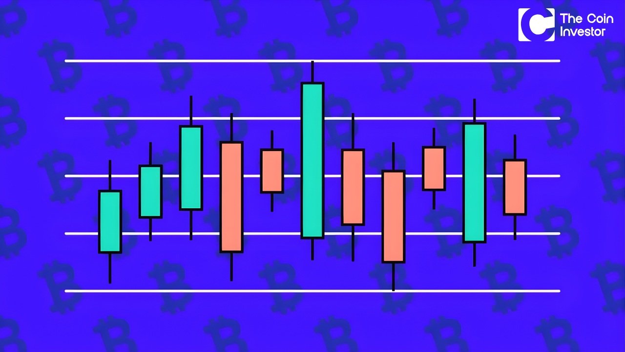
Now that we know what it is, let’s learn how to look at it. You can find the BTC dominance chart on websites like TradingView. It looks just like a normal price chart, but instead of price, it shows a percentage.
Setting Up Your Chart Indicators
When you open the chart, you will see a squiggly line going up and down. This line represents the BTC dom.
To understand it better, we can use tools called indicators. One useful tool is the “Moving Average.”
Imagine the data points on the chart are jumping around a lot every day. It can be hard to see the real direction. A moving average smooths out the line. It takes the average of the last 50 days or 200 days.
To see this clearly, you look at a specific interval of time. You can set the chart to show you what happened every day, every week, or every month. If you are investing for the long run, you should look at longer time ranges.
This helps you ignore the small, messy bumps and see the real trend. Programmers who build these charts use the number of interval periods to decide how much data to show you.
For you, it just means zooming out to see the big picture.
Identifying Key Support and Resistance Levels
Imagine a ball bouncing in a room. It hits the floor and bounces up. It hits the ceiling and bounces down.
On the BTC.d chart, we have “floors” and “ceilings” too.
- Support (The Floor): This is a level where the dominance stops falling. It is like there is a floor holding it up. When BTC dominance gets this low, people usually stop selling Bitcoin and start buying it again.
- Resistance (The Ceiling): This is a level where the dominance stops rising. It hits a ceiling. When it gets this high, people usually stop buying Bitcoin and start looking at other coins.
By finding these levels, you can guess what might happen next. If the chart hits the ceiling, it might be time for it to come down. If it hits the floor, it might be time for it to go up.
Reading Moving Averages on the Dominance Chart
Let’s go back to the Moving Average. If the main BTC.d chart line is above the moving average line, it usually means Bitcoin is getting stronger. The trend is up. This tells us that Bitcoin’s market capitalization is growing faster than the other coins.
If the chart line is below the moving average, it means Bitcoin is getting weaker compared to other coins.
The trend is down. This is often when investors get excited about “Altcoins” (any coin that is not Bitcoin).
Using these lines helps us act with data-driven confidence. We don’t just guess; we look at the lines and the market dynamics.
The Relationship Between the BTC.D Chart and Altcoin Season
This is the most exciting part for many investors. The btc.d chart is like a traffic light for “Altcoin Season.”
Interpreting A Falling BTC.D: The Signal for Altseason
When you see the BTC dominance chart falling down, it means Bitcoin is losing its market share. But where is that money going?
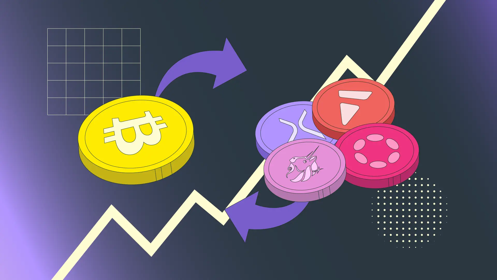
Usually, the money is not leaving the cryptocurrency market. It is just moving. Investors are selling Bitcoin to buy Ethereum, Solana, or other smaller coins. When this happens, the prices of these smaller coins can go up very fast. We call this time Altcoin Season.
Why does this happen? When people feel confident, they want to make more money. Bitcoin is big and steady, but smaller coins can grow faster (they can also crash faster!). So, when the BTC.d chart drops, it is a sign that investors are feeling greedy and happy.
They are willing to take risks.
Interpreting A Rising BTC.D: Flight to Safety
What happens when the line goes up? A rising btc.d chart means Bitcoin is eating up more of the pie. This often happens when the market is scared. Maybe the news is bad. Maybe interest rates in the real world are going up, making money harder to get. When people are scared, they don’t want to hold risky small coins. They sell them and buy Bitcoin because Bitcoin is the most trusted digital money.
We call this a “Flight to Safety.” The money flies out of the small coins and lands safely in Bitcoin.
During this time, the total market capitalization might stay the same, or even go down, but Bitcoin’s slice of the pie gets bigger.
The “Flow of Money” Cycle in Crypto
Money in crypto moves in a circle. It is like the water cycle in nature.
- Bitcoin Phase: First, money comes from fiat currencies (cash) into Bitcoin. Bitcoin price goes up. BTC Dom goes up.
- Ethereum Phase: When Bitcoin gets expensive, people move money into Ethereum. BTC Dom starts to fall.
- Large Cap Phase: Then, money moves to other big coins.
- Altseason: Finally, money moves to the tiny, risky coins. BTC Dom is at its lowest.
- Return to Bitcoin: When the party is over, or people get scared, they sell the small coins and go back to Bitcoin or cash. The cycle starts again.
Understanding this flow helps you know when to move your own investments.
Trading Strategies Using the BTC.D Chart

At The Coin Investor, we want you to have actionable insight. Knowing the theory is good, but how do you use it to build wealth?
Using BTC.D to Time Your Entries and Exits
You can use the btc.d chart to decide when to enter a trade.
- Strategy 1: The Bitcoin Buy. If btc.d chart is at a “support” level (the floor) and starts bouncing up, it is usually a good time to just hold Bitcoin. Don’t buy small coins yet.
- Strategy 2: The Altcoin Buy. If btc.d chart hits a “resistance” level (the ceiling) and starts to curl down, this is your signal. It might be time to buy your favorite Altcoins.
You are watching the ratio of bitcoin to see who is winning the tug-of-war.
Correlation: Comparing BTC Price Vs. BTC Dominance
This is a little bit advanced, but you can do it! You need to look at two charts at the same time: The Bitcoin Price chart and the BTC dominance chart.
- Scenario A: Bitcoin Price goes UP + BTC Dominance goes UP.
- Meaning: Bitcoin is strong. Money is coming in from the outside world directly into Bitcoin. Altcoins might not move much.
- Scenario B: Bitcoin Price goes UP + BTC Dominance goes DOWN.
- Meaning: This is the best time! Bitcoin is going up, but Altcoins are going up even faster! This is a massive Altcoin Season.
- Scenario C: Bitcoin Price goes DOWN + BTC Dominance goes UP.
- Meaning: The market is crashing. People are selling Altcoins fast and running to Bitcoin, but even Bitcoin is losing value. This is a scary time.
By comparing these market quotes, you can see the true health of the crypto market.
Managing Portfolio Risk Based on Dominance Trends
Risk means the chance of losing money. We want to lower that risk.
If the BTC.d chart is climbing high, it is risky to hold a lot of small coins. Your portfolio value might drop a lot. In this trend, it is safer to keep your money in Bitcoin or stablecoins.
If the BTC.d chart is falling, the risk of holding Bitcoin is that you miss out on bigger gains elsewhere.
Smart investors use the dominance metric to balance their bags.
If dominance is high, keep 80% in Bitcoin. If dominance is falling, maybe move some of that to 60% Bitcoin and 40% other coins.
This is how you use market dynamics to protect your wealth.
FAQ’s:
What Does the BTC.D Chart Actually Measure?
It measures Bitcoin’s share of the total crypto market. It takes bitcoin’s market capitalization and divides it by the total crypto market cap. It tells us if Bitcoin is the main focus or if other coins are getting attention.
Where Can I Find the Official BTC.D Chart?
You can find it on TradingView by searching for “BTC.D“.
You can also see the percentages on CoinMarketCap or CoinGecko. These sites use the coinmarketcap api pricing page data to show you the numbers. They pull data points from all over the world to give you the exact percentage.
Does A Dropping BTC.D Chart Mean Bitcoin’s Price is Crashing?
No! This is a very common mistake. The BTC.d chart can drop even if Bitcoin’s price is going up. How? Imagine Bitcoin goes up by 5%, but Ethereum goes up by 10%. Bitcoin is doing well, but Ethereum is doing better. So, Bitcoin’s “slice of the pie” gets a little smaller, even though the pie itself got bigger. A dropping dominance just means other coins are growing faster than Bitcoin.
What Is A “Good” Level For BTC.D to Be At?
There is no “good” or “bad” level. It depends on what you want. If you love Bitcoin, you want it high. If you love Altcoins, you want it low. Historically, levels around 40% have been the “floor,” and levels around 70% have been the “ceiling” in recent years.
Can I Trade the BTC.D Chart Directly?
Usually, no. You cannot buy one “share” of Bitcoin Dominance like you buy a stock. However, on some advanced platforms, there are special contracts (BTCDOM) that let you bet on whether the number will go up or down.
But for most people, we use the chart just as a map to help us trade actual coins.
Conclusion
The world of cryptocurrency moves very fast. Prices change every second. But the BTC.d chart gives us a steady guide. It cuts through the noise and shows us the truth about market sentiment.
By understanding bitcoin dominance, you are no longer just guessing. You are seeing the battlefield from above. You know when to stick with the safety of Bitcoin and when to take a chance on new, exciting coins. You understand how the market share shifts back and forth.
At The Coin Investor, our goal is to give you the knowledge to be a confident investor. We want you to understand the market dynamics, use the data, and make smart moves. Whether you are checking the latest API endpoint data or just looking at a simple chart, remember that knowledge is your best asset.
Keep learning, keep watching the trends, and let the data guide you to growth. This is how we build the future of finance, one block at a time.